Colour theory.
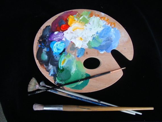
As an artist I think about colour using an established colour model. The primary colours are Blue Red Yellow, [BRY]. With these three colours I can, in theory, mix any other colour. The secondary colours if you mix two primaries are Purple, Orange, and Green. Simple and well proven!

The problem.
My problem is that many years ago, when I started looking around inside my first computer, I was puzzled. There seemed to be two conflicting sorts of colour language in Adobe PhotoShop software. There was ‘CMYK’ and ‘RGB’.
CMYK stands for Cyan Magenta Yellow and Black, which didn’t make any sense at all.
Firstly, Black should be B and not K.
Secondly, why use Cyan and Magenta instead of Blue and Red?
RGB stands for Red Green Blue, which made some sense for me as an artist.
So why does the Red Green Blue colour model exist? And where does it get used? Why is it on my computer? And what on earth is the reason for the CMYK set of colours?
The explanation.
When you look into it you will quickly find that RGB is the set used by electronic display on computer screens etc, whereas CMYK are used in the printing industry. BRY is not used anywhere except in an artists studio.
The crucial factor is that there are two ways that colour is made. Additive and subtractive. Do you start with no light and add colours or do you start with saturated light and take away stuff to reveal the colour that you want?
With subtractive colours the more colours you mix, the darker the resulting colour. This is because pigments are reflecting light. The surface absorbs all the other light. This is also why the black colours get hotter quickly, because it absorbs (almost) all light energy and reflects (almost) none. So the paper or canvas that we print or paint on usually starts by being white. As we add colour it gets darker and darker and ends up being black.
On the other hand, with additive colours, the more you add, the brighter the colours become. This is because they are emitting light. So your computer screen starts by being quite black and as you add RGB colour the image is revealed, getting brighter and brighter. All the colours at once makes white. This is why daylight is (more or less) white, since the Sun is emitting in almost all the visible wavelength spectrum.
So if you start with a blank slate and add colours you would choose BRY if you are an artist, or CMYK if you are a printer.
At first I thought that CMYK is favoured by printers because it can be reproduced over and over with agreement about the exact colours making the mix. They have to put the ink into their machines and must get it right every time. Artists using BRY will agree that there are zillions of versions of Red and Blue, so specific constant agreed versions, Magenta and Cyan, makes some sense.
Nowadays many print machines printing fine art will actually use seven eight or even twelve colours. On my own wide format inkjet fine art printer I use Matt Black, Light Black, Magenta, Light Magenta, Cyan, Light Cyan, and Yellow. Whereas, in my studio I might use a palette of twenty, thirty, or even more colours when painting a picture. And I have many more at my disposal for different pictures. That would not make sense for a printer. So I guessed that many years ago printers settled for CMYK as the basic set of colours when they started to do commercial colour printing.
But I was wrong!
So what is RGB? Well one fact is worth recognizing here. Our human eyes have colour receptors at the back of our eyeballs. One set specifically sees Red, another set see Blue, and another set see Green. There isn’t a set for Yellow!
I wrote about this in a previous blog all about green leaves and red berries here.
Our eyes see colour by subtracting from all the incoming light and recognizing the different wavelengths of light emitted from a distant source. For instance, we can see that a strawberry is red because it reflects and sends out red light. The light is red because the strawberry absorbed all the other light and only reflected the red part of the spectrum. And the red receptor cells in our eyes were able to see that.
Other surfaces reflect different colours that we humans can see with our Red Green and Blue light receptor cells. This means that light exists with a RGB spectrum.
But hey! Look at that illustration again.
The secondary colours of RGB are, cyan, magenta, and yellow. They are formed by the mixture of two of the primaries and the exclusion of the third. Red and green combine to make yellow. Green and blue make cyan, and blue plus red make magenta. The combination of red, green, and blue in full intensity makes white.
It makes some sense when you look at this RGB spectrum. I can see that R and B make Magenta. I can see that G and B make Cyan. But it is not obvious that mixing R and G would make Yellow. Neither is it obvious to this artist that mixing RMBCGY would make White.
But it does when you use additive colour on a computer.
The combination of two of the standard three additive primary colours in equal proportions produces an additive secondary colour—cyan, magenta or yellow—which, in the form of dyes or pigments, are the standard primary colours in subtractive colour systems.
The subtractive system using primaries that are the secondaries of the additive system can be viewed as an alternative approach to reproducing a wide range of colours by controlling the relative amounts of red, green, and blue light that reach the eye.
It is a funny, complicated, old world ain’t it?
******************************************************************************************


