GREEN LEAVES AND RED BERRIES
The theory goes like this… Humans evolved from tree dwelling apes that lived in a green world where the dominant colour was created by the green chlorophyll in the leaves. The plants couldn’t much avoid having green leaves. But plants wanted tree dwellers to assist in plant reproduction by eating and spreading their seeds. So the cunning plants coloured the seeds in the opposite colour, red, to make it easier for the seed spreaders to find the seeds. The seed spreaders, that includes you and me, evolved at the same time with a visual system that had the ability to recognise the useful plant colouring system and get the rewards included in the clever plant strategy, namely bright red ripe sweet fruit.
In the back of our human eyes are cone shaped cells that are colour receptive. We still have cone cells that are especially tuned to red and others that are receptive to green so that we can see the difference. The third bunch are receptive to blue. So our eyes are particularly good at seeing the difference between red and green or red and blue.
Nowadays we have come down from the tree tops but evolution takes a long time to change so we still have a visual system that favours the distinction between the opposite colours of green and red rather than say purple and yellow, or orange and blue.
We are nowhere nearly as good at seeing yellow. It is as though we have to deduce yellow by using our green receptors and taking away blue to leave the yellow. That is not very efficient which is why yellow is weaker than red or blue.

COLOUR WHEEL
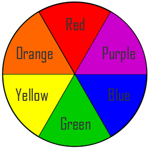
I say green and red are opposites, same as purple and yellow are opposites or orange and blue are opposites. But that is the artist in me saying that. Artists have a way of understanding colour that is simple and quite different to the way many others see and understand colour. Artists visualise the colour spectrum as a colour circle. We recognise three primary colours, red, blue, and yellow, equally spaced around the circle. Basically mixing other colours together cannot create the primary colours, whereas their opposites are a mixture of the two adjacent primaries.
Purple and yellow, or orange and blue are both examples of opposites in the circular colour spectrum. In each pair one is a primary colour and the opposite secondary colour, in the same way that red is a primary colour and green the opposite secondary colour. Green is a mixture of blue and yellow, purple a mixture of red and blue, and orange a mixture of yellow and red. If an artist wants to emphasise a colour then he or she can surround it in the opposite colour. Yellow is very impressive on a purple background. Orange on a blue ground is stunning. Green on red, or red on green, also works well as in nature and those clever cunning plants.
We artists are aware of the significance of this circular colour spectrum with the three primaries and three secondary’s, but the interesting thing about it is that the circular spectrum doesn’t seem to exist in nature. Instead we witness the spectrum as being linear as seen in a rainbow. ROYGBIV or Richard Of York Gave Battle In Vain are the rainbow colours Red Orange Yellow Green Blue Indigo Violet. So red is a long way from violet in a rainbow yet right next to it in a colour circle. Why is that?
Commercial printers use very specific versions of red blue and yellow. They choose Magenta, Cyan and Yellow. These are often abbreviated to CMY with an added K to stand for black. So you will see CMYK spectrums around more often than simple artists RBY.
However, there is another popular version known as RGB colour. This explanation is based on whether the colour is additive or subtractive. And there is all the history about how colour has been understood over time with input from Isaac Newton and Goethe for instance. But that is another story for another blog sometime in the future, maybe.
For now let’s keep it simple. Red, blue and yellow.


