THE GOLDEN RATIO
THE GOLDEN RATIO or Golden Mean, Golden Proportion, Golden Number, Golden Cut, or Divine Section is a seemingly magic number that occurs in art, mathematics, and nature.
Basically it is simple. A line can be divided into two so that the ratio of the two parts is the same as the ratio of the larger to the whole. In fact the magic number is 1.6180339887, but I suggest that you forget that.
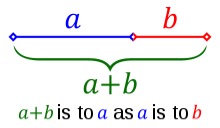
Golden ratio line
If you use the formula in squares instead of line it starts to look rather nice.
This is from Wikipedia on their Golden Ratio page.
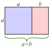
Golden rectangle
A golden rectangle (in pink) with longer side a and shorter side b, when placed adjacent to a square with sides of length a, will produce a similar golden rectangle with longer side a + b and shorter side a.
And the whole thing gets even more interesting when you continue the process.
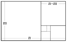
Golden ratio squares
And then put a spiral in.
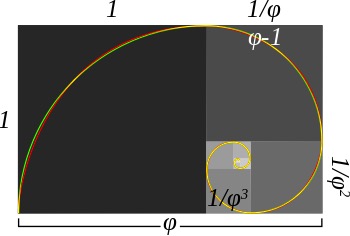
Golden spiral
This is found in nature as well. It seems to occur as patterns in plants, leaves, biology, chemistry and even the human genome.
The ratio also links to the Fibonacci sequence 1, 1, 2, 3, 5, 8, 13, 21, 34, 55, 89, 144, 233, 377, 610, 987, ….
But stop, that is enough!!
Why is all this in my art blog?
Well, did you see that the proportions in the golden rectangle illustration earlier were rather pleasant? The position of the dividing line just looked good.
And other artists have agreed. Salvador Dali used the golden ratio in his masterpiece, The Sacrament of the Last Supper. Mondrian has been said to have used the golden section extensively in his geometrical paintings.
Is that because the golden ratio plays a role in human perception of beauty?
Studies by psychologists, starting with Gustav Fechner, have been devised to test the idea. Fechner found a preference for rectangle ratios centred on the golden ratio. But the findings have been contested.
However, I really like the balance between the two areas in the golden rectangle illustration. The relationship between the two blocks is very comfortable. It doesn’t over-do the dominance of one side. It is a shame that Wikipedia chose to colour the blocks blue and pink because that might symbolise male and female. But please ignore that.
And in the spiral illustration the position of the focal point is just right for a ‘centre of interest’ in a landscape. Or if you turn it round then it would make a great location for the ‘centre of interest’ in a portrait.
It makes you wonder!

